


Show My Colors: Color Palettes
4.286.00 Reviews
App Specs
- Version
- 1.55
- Updated On
- License
- Free
- Downloads
- 1,000,000+
- Developer
- BrilliantSeasons
- Categories
- Beauty
- Platform
- Android, iOS
Screenshots
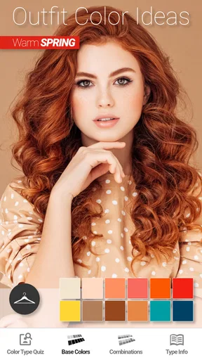
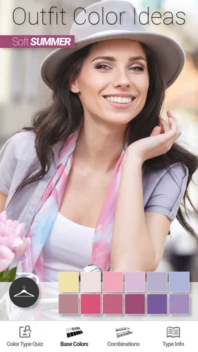
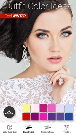
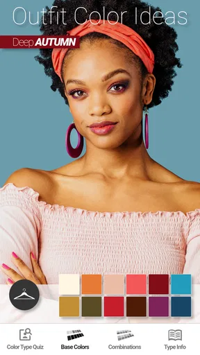
 Analysis by AppCompare
At home, choosing a color is rarely a solo decision. I might be trying to find a scarf that works with a coat while someone else is comparing paint samples or planning a craft project. Show My Colors: Color Palettes is most useful in those little moments when a few colors need to make sense together, and a quick visual reference is easier than guessing from memory.
A color helper for shared decisions
I like the idea of passing a palette around during a household shopping trip or using it to get a conversation started before buying something for a shared space. A photo of a cushion, a favorite outfit, or a landscape can give everyone a common starting point. Instead of arguing over whether two shades “feel right,” you can look at the colors together and decide which ones fit the mood you want.
That doesn’t make the app a household organizer or a substitute for agreeing on a budget and style. Its value is narrower and more practical: it helps turn a vague color preference into a palette people can discuss. For a shared room, I’d use it to compare a few possible directions first, then check the actual materials in the room before making a purchase.
Keep the workflow simple on a shared device
If more than one person uses the same phone or tablet, I’d treat saved palettes as a shared visual notebook rather than assume they belong to separate household profiles. The app’s palette tools can help with ongoing projects, but shared-device use also means being clear about which saved colors are for which person or task. Descriptive labels can do useful work here: “guest room,” “school poster,” or “winter outfits” is easier to interpret later than a string of unlabeled swatches.
For personal projects, I’d avoid saving every passing experiment. Keeping a small set of useful palettes makes it easier to return to a real decision, especially when you’re standing in a shop and trying to compare an item with a color idea you saved earlier. The trade-off is that a shared collection can become cluttered if nobody labels or reviews it.
Use palettes to coordinate, not to settle every disagreement
A palette is a helpful conversation starter, but it cannot decide whether a color suits a particular person, room, or occasion. If one person likes muted shades and another prefers bright ones, I’d use the app to create two or three distinct options rather than trying to force one “correct” answer. That makes it easier to identify a compromise, such as keeping a shared background neutral and using a stronger shade as an accent.
There’s also a practical difference between choosing colors on a screen and buying physical products. Display settings, lighting, fabric, paint finish, and surrounding colors can all change how a shade looks. I’d use a palette to narrow the choices, then compare samples in the place they’ll actually be used. That extra step matters most for expensive or permanent decisions such as paint, where a phone screen should not be the final judge.
Worth Reading Before You Choose

EA SPORTS FC Mobile 26 Is a Bigger Football Game, but It Takes Time

Flipboard Shows What News Apps Must Do Beyond the Feed

Switching to Android Auto Means Rethinking Your Driving Routine

Google Calendar Makes a Crowded Week Easier to Manage

Ludo King Makes the Most of the Minutes Between Plans

Baby Panda World Brings Quick Play to Modern Phones, but Its Game Library Feels Busy
Age and expectations
The app is rated for Everyone, which makes its color-focused purpose approachable for a broad age range. I can imagine a child using it with an adult to explore a picture or pick colors for a craft. For younger users, I’d keep the activity focused on the palette itself and make sure an adult handles any shopping decisions or shared-device boundaries.
It is still worth setting ordinary expectations for a device used by several people: decide whose photos and palettes are being used, and avoid treating a shared screen as a private workspace. I wouldn’t choose this app as a way to manage family accounts or coordinate household tasks; its role is to help with color choices, not to provide those controls.
As a beauty app from BrilliantSeasons, it is aimed at practical color inspiration rather than a full image-editing or design suite. It is free to install, with optional in-app purchases priced from $2.99 to $4.99 per item. That makes it easy to try before deciding whether its particular approach fits your routine. Its average rating is 4.2 from around 2,600 ratings, and it has passed one million installs, so it has found an audience without that popularity being a guarantee that every feature will suit you.
Getting Started with Show My Colors
First things first, installing Show My Colors: Color Palettes was a breeze. Available for both Android and iOS, you can find it on Google Play and the App Store. The interface is clean and intuitive, which I appreciated right off the bat. No need to fumble around trying to figure out what does what.
Upon opening the app, you’re greeted with a welcome screen that feels, well, welcoming! The app offers a quick tutorial on how to navigate through its features, and trust me, you’ll want to pay attention to this part because there’s a lot to unpack.
Exploring the Features
Now, let's dive into the good stuff. The app's main feature is the ability to create custom color palettes. You can either start from scratch or let the app generate suggestions based on a base color you choose. I played around with a few base colors, and the suggestions were impressively on point.
One of the things I love is the ability to extract colors from photos. Yep, just snap a pic or upload one from your gallery, and the app will pull out the most dominant colors for you. I tried it with a photo of a sunset I took last summer, and the palette it generated was stunning.
Color Harmony and Inspiration
If you're like me and sometimes struggle with figuring out what colors go well together, Show My Colors has got you covered. The app uses color harmony theories to suggest complementary, triadic, and analogous color schemes. It's like having a cheat sheet for color theory.
For those moments when inspiration is running low, the app features a community section where users can share their own palettes. Browsing through other people's creations is not only inspiring but also gives you a sense of community. It's always nice to know that you're not alone in your quest for color perfection.
Customizing and Saving Palettes
Once you've settled on a palette, you can customize it further by adjusting the saturation and brightness of the colors. I found this particularly useful when trying to match colors for a project. The app also lets you save your palettes, so you can come back to them later or even share them with friends or colleagues.
Another nifty feature is the ability to label each color in your palette. This might seem minor, but it’s super helpful if you're working on a project and need to keep track of which color is for what purpose.
Real-World Applications
So, how does Show My Colors hold up in real-world scenarios? Pretty darn well, if you ask me. I used it to pick out colors for a digital illustration I was working on, and the final product looked cohesive and visually appealing. I also tried it when redecorating my living room. The app helped me choose a color scheme that tied the room together beautifully.
For anyone in the fields of design, fashion, or even just someone who enjoys crafting, this app is a game-changer. It's also a great tool for those looking to improve their understanding of color theory and application.
Final Thoughts
In conclusion, Show My Colors: Color Palettes is a fantastic app for anyone looking to enhance their color selection skills. Whether you're a professional designer or just someone who loves playing with colors, this app offers valuable tools and inspiration. It's user-friendly, packed with features, and genuinely helpful in making color selection less daunting and more fun.
If you’re curious to explore the world of colors in a new and exciting way, I highly recommend giving Show My Colors a try. Who knows? You might just discover your inner color expert!
Where it fits among beauty and color tools
When I compare it with the usual alternatives, I see a different job from a makeup try-on tool, a shopping app, or a full design program. Those tools may help you preview a product on your face, browse items for sale, or build a finished visual project. This app is more about choosing and organizing color relationships before you take the next step. That makes it handy when you already have a garment, photo, or idea in mind, but less useful if what you need is a direct product recommendation or a realistic preview of makeup on your own face.
For beauty shopping, I’d use a palette as a guide rather than a guarantee. If I’m choosing lipstick or clothing, I can note the colors I’m drawn to and compare them with the actual product under ordinary lighting. A palette can clarify whether I’m leaning warm, cool, vivid, or subdued, but personal taste and how a shade looks against skin still matter. Someone who wants a definitive seasonal color diagnosis may prefer a dedicated consultation or a more specialized color-analysis service.
A useful routine before buying
Here’s a realistic way I’d use it: before leaving home, I’d photograph an item I already wear often, then use its colors as a starting point for a new purchase. In a shop, I could compare a candidate garment with that reference and ask whether it complements the existing piece or introduces a color I actually want to wear. The app won’t replace checking fabric and lighting in person, but it can help me shop with a clearer intention instead of buying a shade that only works in isolation.
For makeup, the same approach is useful when building a coordinated look for an event. I’d take inspiration from an outfit or accessory, find a few related colors, and use those as a shortlist while browsing products. I would not assume that a screen palette predicts finish, texture, or how a cosmetic will wear. The practical win is reducing the number of shades I’m considering, not eliminating the need to test products sensibly.
Small choices that improve the result
Photo extraction is strongest as a source of inspiration, not a precise measurement tool. A sunset image may include reflections, shadows, and camera processing, so the dominant colors can differ from what your eyes remember. I’d choose a photo with clear, well-lit areas when I want a useful palette, and I’d crop or frame the subject closely if the background would otherwise dominate the result. For a product or room reference, taking the picture in even light can make the extracted colors easier to interpret.
Another useful habit is to decide what each palette is for before adjusting it. A palette meant to guide an outfit can tolerate expressive accents; one for a room may need colors that remain comfortable across a larger area. When I adjust brightness or saturation, I’d make small changes and compare the result with the original rather than pushing every color in the same direction. This helps preserve contrast and keeps a set of shades from becoming either too loud or too washed out.
Saving and sharing are helpful when a choice involves another person, but they work best when the palette has a clear purpose and a short label. I’d send one focused option to a friend or colleague rather than several near-identical versions, then ask a concrete question such as which accent feels calmer. That turns a palette into a practical decision aid instead of an open-ended request for opinions.
Who will appreciate it—and who may not
I think the app suits people who enjoy making visual choices but want a little structure: someone assembling outfits, planning a craft, collecting room ideas, or learning how color harmonies work. It can also help a household coordinate a shared project without requiring everyone to have the same taste. The strongest fit is for people who are happy to explore colors and make the final call themselves.
I’d skip it if I wanted a one-tap answer to “what should I buy?” or a professional-grade workflow with detailed production controls. It is also not the best match for someone who dislikes experimenting with palettes or who needs exact physical color matching for print, paint, or manufacturing. In those cases, a specialist tool, calibrated workflow, or real-world sample is more dependable. The app is a useful guide, not a substitute for those decisions.
Practical details and my household verdict
The app first appeared on April 7, 2020, and its current version is 1.53. It supports devices running Android 9 or later. Those details matter if you are installing it on an older household phone: check the device’s system version before making plans to use it together. The Everyone age rating makes its subject matter broadly approachable, while shared-device habits still call for ordinary care around personal photos and saved work.
My household verdict is positive as long as expectations stay modest. I’d keep it around for visual brainstorming, shopping preparation, and small creative projects, especially when more than one person has a say in the color choice. It is not a family coordination system, a makeup try-on service, or a final authority on how a shade will look in real life. Used for what it does well—turning a starting color or photo into ideas worth considering—it can make everyday choices less guessy and more enjoyable.
Pros
- User-friendly interface for easy navigation.
- Wide variety of color palettes available.
- Customizable options for personal taste.
- Supports exporting palettes for design use.
- Regular updates with new features.
Cons
- Limited free features without subscription.
- Occasional ads can disrupt user experience.
- Requires internet for full functionality.
- Some features hidden behind paywall.
- Initial setup can be slightly complex.
FAQs for Show My Colors: Color Palettes
What is Show My Colors: Color Palettes and who is it for?
Show My Colors: Color Palettes is an app designed for artists, designers, and anyone interested in exploring and creating color palettes. It allows users to generate, save, and share color schemes with ease. Whether you're a professional designer or someone who loves experimenting with colors, this app provides the tools you need to enhance your creative projects.
How do I create a color palette using Show My Colors?
Creating a color palette is simple. Start by selecting a base color, then use the app's tools to explore complementary, analogous, or custom combinations. You can adjust hue, saturation, and brightness to fine-tune your palette. Once satisfied, save your palette for future use or share it with others directly from the app.
Does the app support importing images to extract colors?
Yes, Show My Colors allows you to import images and automatically extract dominant colors to create palettes. This feature is perfect for designers who want to draw inspiration from photographs or existing designs. Simply upload an image, and the app will generate a palette based on the most prominent colors found in the photo.
Is Show My Colors available for both Android and iOS?
Yes, Show My Colors: Color Palettes is available for download on both Android and iOS platforms. Users can find and install the app from the Google Play Store and Apple App Store, ensuring compatibility with a wide range of devices, whether you are using a smartphone or a tablet.
Are there any costs associated with using Show My Colors?
Show My Colors offers a free version with basic features, allowing users to try out the app and create simple palettes. For advanced features like unlimited palette saves, premium color models, and ad-free experience, there may be a subscription or one-time purchase option. Check the app store for detailed pricing information.


